• WORK
  • CASE STUDIES
  • ABOUT
  • CONTACT
We Are William - Branding & Design
  • WORK
  • CASE STUDIES
  • ABOUT
  • CONTACT

Greater Flagstaff Chamber of Commerce

Founded in 1891, the Flagstaff Chamber of Commerce has been a proactive leader in creating and promoting a strong local economy. As one of the larger and more active chambers in the state, it has been successful in representing the interests of business locally, regionally and statewide.

The Chamber approached us earlier this year, to work on a rebrand. Chamber growth and advancement was not reflected in the Chamber's original logo since it hadn’t been updated in decades. With this gap in perception, the new logo includes a name change from ‘Flagstaff Chamber of Commerce’ to ‘Greater Flagstaff Chamber of Commerce.’ The name change as well as a fresh updated look revitalizes the perception of the Chamber and represent its forward thinking and well respected voice for business. It communicates a clear message that the Greater Flagstaff Chamber is relevant to today’s business climate and actively supports its members and the growth of the local economy.


LOGO CONCEPT

Iconography
The iconography of the Greater Flagstaff Chamber should represent strength, innovation and forward moving in a contemporary, solid and confident way.


Color
To keep some aspects of recognizability of the old logo, we suggest remaining in the range of blue colors, but modernizing the look by selecting a different shade of blue.


Primary Type
The typeface we chose for the main logo is called Cala. It’s a classic old style serif typeface that has a notable contemporary feel to it. We selected this particular font to give the logo an established look as well as recognizing its history. It’s a sturdy font that has a low stroke contrast, larger and more open counters, and taller x-height, which provides great
legibility even at a small size.


Secondary Type
We suggest the use of a secondary typeface in the overall branding collateral to complement the main logo and add visual interest. To balance the old style serif typeface we selected a sans serif font called Effra, that also has great legibility.


Final Logo
Combining the icon concepts with the type and color, we have a solid logo-mark that represents strength and leadership, while offering an inclusive feel that represents local as well as regional members.


Thursday 04.17.14
Posted by Danielle O'Connor
 

There's Magic in the Fair

At the beginning of the year we were chosen to design the artwork for the Coconino County Fair here in Flagstaff, AZ. What exciting news! Who doesn't like going to the Fair? We couldn't have found a more fun project to work on. We were also excited to do more local work and knowing that our artwork for the County Fair would be all over Flagstaff and seen by many people gave us even more motivation to create something really unique.

The first hurdle we came across though was the logo. A couple of years ago our client, Coconino County Parks & Recreation, had set up a logo that was supposed to be reused for at least 10 years. While the concept was really fun, the actual logo was a bit challenging to use. The issue was that it's made up off a bunch of different illustrations making up the word FAIR. Because of that, scaling down the logo and adding it somewhere smaller was impossible since it would lose readability. Looking at the past year's designs, we felt that the layout was lacking a focal point and that there were just too many competing elements. We felt that either the headline or the Fair logo should take precedence over the other. Creating separate logos for each one just made it hard to focus on one thing.

We felt that that if you just glanced at the layout it should offer an instant read. Think about driving by a poster for the Fair and you just have a couple seconds to look at it and figure out what it is about. What do you think should stand out? You want people to instantly know what the poster is for, in this case the Fair. Everything else, such as the tagline or the date is secondary. So our solution was to make the word FAIR the hero, but have the design communicate what the tagline or theme is about and therefore creating an instant read and cohesive look. We achieved that by creating a logo lock-up that included all the important information and also established a hierarchy.

New Logo Lock-up

New Logo Lock-up

The tagline or theme our client had picked for this year's Fair was "There's Magic in the Fair". We brainstormed for a long time, trying to come up with different ideas of how to translate the theme into a compelling visual. The idea that stood out the strongest to us in the end, was the emotional connection we wanted to make. We wanted to instantly bring back the warm, fuzzy feeling, that memory that so many of us have of going to the Fair as a kid for the first time. The magic of seeing a roller coaster for the first time, the smell of the delicious fair treats, the music and the lights, and the special time spent there with our families. So we tried to capture that magical moment by using an illustration of a little girl on her dad's shoulders, walking into the fair for the very first time. It's just at that time of the day when the sun goes down, the colors of the sky changes and the first stars are becoming visible. The time when all the lights come on and everything together creates a beautiful "magical" atmosphere. 

Fair Book Cover

Fair Book Cover

Thursday 09.05.13
Posted by Danielle O'Connor
 

Wanderlust Brewing Co.

Wanderlust Beer Illustrations - Flagstaff, AZ

Wanderlust Beer Illustrations - Flagstaff, AZ

It's no secret that we love beer. Danielle is from Germany and I have the whole Irish thing going on. So it was with great pleasure when we hooked up with Nathan Friedman at Wanderlust Brewing Company here in Flagstaff, AZ. He brews some really great, and interesting, beer. From the Pan American Stout, his Saisons and my personal favorite, the Chateau Americana Belgian Pale ... they're all really good. 

We have some more pieces on the way but wanted to give a sneak peek of some of the artwork we've done at the onset.

Prost!

Wanderlust 'Southbound Westy' Event Poster Design - Flagstaff, AZ

Wanderlust 'Southbound Westy' Event Poster Design - Flagstaff, AZ

Wednesday 02.20.13
Posted by Tommy OConnor
 

Fessler Acupuncture

I met Whitney Fessler at a big convention here in Flagstaff. As newly transplanted residents we started comparing our experiences with starting our respective businesses. The thing that stood out to me about Whitney was that she was extremely passionate about acupuncture. The love she has for her craft was a breath of fresh air.

Soon after the convention, Whitney contracted us to work on her new logo. During the discovery phase we uncovered some themes that would help us in crafting the new logo. The first theme was that, frankly, needles are scary. People who aren't already familiar with acupuncture can be intimidated by it. We needed to make sure that we appealed to the positive effects of acupuncture, and do so in a very soft way. The second theme was that Whitney really wanted to pay tribute to the eastern roots of acupuncture. We spoke briefly about the Yin and Yang symbol and how the concept behind it was amazing, unfortunately the traditional visual was overused and cliche.

The Yin Yang symbol idea kept popping up. I knew that extricating a traditional Yin Yang symbol from it's cliched existence was a fools errand. So I forced the thought out of my mind until, while researching acupuncture, I stumbled upon the I Ching Trigrams (more info). The Yin Yang symbol as used by the I Ching is beautiful, balanced and powerful. Perfect! We now had a wonderful nod to the eastern roots of acupuncture. Next we had to figure out how to make the brand soft assuage and entice the uninitiated.

The I Ching Trigram Yin Yang symbol.

The I Ching Trigram Yin Yang symbol.

We wanted to contrast the strength of the Yin Yang symbol with a softness. Rooted in the act of healing is a sense of kindness and caring -- It can be a very spiritual process, especially when it comes to eastern medicines like acupuncture. It's also very organic and grounded in nature. Danielle and I quickly became obsessed with the idea of watercolor. The organic, peaceful and spiritual qualities of watercolors could help us undercut the anxiety someone might feel in choosing acupuncture as their healing path.

Watercolor.jpg

We put them together and this is the final logo:

Logo.jpg
Monday 01.28.13
Posted by Tommy OConnor
 

Rebranding eegee's - Part 1 - "Where to Begin?"

new eegee's logo, 2008

new eegee's logo, 2008

In 2007 eegee’s hired us to consult on their current identity. As we went through our paces it became clear that a full rebrand was in order. The existing branding just didn’t do a good job of conveying the excitement of eegee’s. 

Let me take a step back and explain what eegee’s is. If you aren’t familiar with Tucson, Arizona then you wouldn’t know of the restaurant chain. If you are familiar then you know the kind of cult following eegee’s enjoys. For those who are uninitiated: eegee’s is a 40-year-old restaurant chain that was started by two University of Arizona college graduates in 1971. They started with a van and a dream and over 40 years turned it into a 23-location chain. The most identifiable item they serve is a frozen fruit drink, also called eegee’s. They became very involved in the community, and the company continues that involvement today. They developed a near 100% usage policy in their warehouse way before that practice became fashionable. They are well loved. Just do a search on Twitter for ‘eegees’ and you’ll get a taste of the kind of following they enjoy.

When you have a loved brand and you’re in charge of altering the image of that brand, there is a lot of pressure to not disassociate the brand from the image people have who love it. This was something we took very seriously. The issue is three-fold: A) We needed to evolve the eegee's brand so that it could thrive in new markets. B) There's a cult-like following for the brand that we could not jeopardize. C) The current branding was so dated it would be hard to keep any of it. You can see the tightrope we were walking.

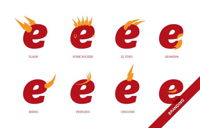
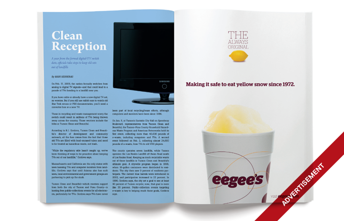
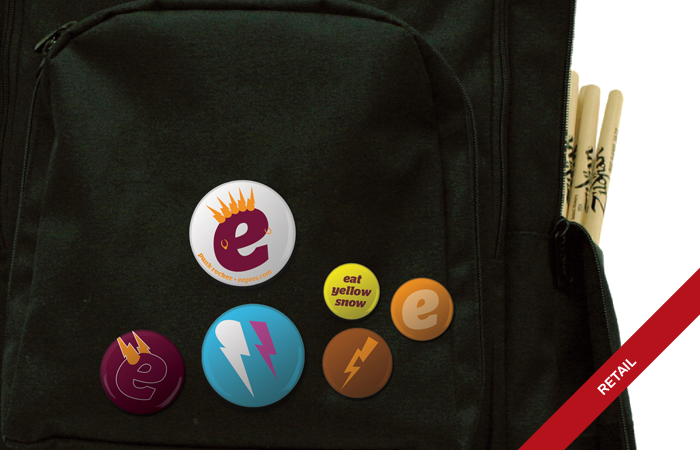
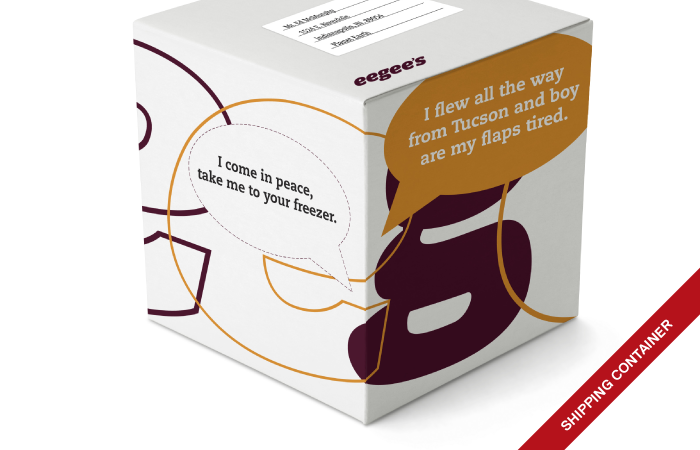
Once we came to the conclusion that a cosmetic change wasn’t going to be enough to properly position eegee’s for expansion we put together a comprehensive branding presentation that consisted of the new logo and also potential usage and brand potential. You can see some of the images from the presentation here:


eegees_logo_pres1.png
eegees_logo_pres2.png
eegees_logo_pres3.png
eegees_logo_pres4.png
eegees_logo_pres1.png eegees_logo_pres2.png eegees_logo_pres3.png eegees_logo_pres4.png

Logo

We decided pretty early on that the logo should be a stand-alone word mark. It’s just more honest. We didn’t want an icon to convolute and distract the brand. Also, we felt that it would be more accepted by the fans this way. In lieu of an icon paired with the wordmark we decided that we would also use a supporting iconography to complete the ‘brand.’ The iconography could change every few years to keep the brand fun and fresh, but the word mark could stand forever.


old logo

old logo

happy little 'e'

happy little 'e'

The old logo first used a ribbon to underline the wordmark, and then they updated the ribbon with a lightning bolt. We wanted pure, timeless and honest but still fun. With a name like eegee’s it was obvious that the most important issue to tackle in picking a new typeface was finding the perfect letter e. It’s a six-letter name and four of those letters are e’s. After an exhaustive search, Stag Italic was chosen. The e looks like it’s happy and laughing which was absolutely perfect for what we were looking for.

Iconography

“What is eegee’s?” We asked this question as often as possible. What it came down to is that eegee’s is an integral part of peoples lives in Tucson. They pick up eegee’s for events. High school kids skip class and head to eegee’s. People enjoy it in the pool or at the park with their kids. On hot days eegee’s doesn’t just make living in Tucson bearable, it makes it fun. Fun is the key, the eegee's experience is fun. We then set off to graphically illustrate the fun.


illustrations, 2009

illustrations, 2009

We decided on using hand drawn sketch illustrations of fun things. We created illustrations of everything from trikes and ring-pops to rocket ships and laser blasters. FUN!

Tuesday 10.02.12
Posted by Tommy OConnor
 
Newer / Older

©2013 We Are William, LLC