In 2007 eegee’s hired us to consult on their current identity. As we went through our paces it became clear that a full rebrand was in order. The existing branding just didn’t do a good job of conveying the excitement of eegee’s.
Let me take a step back and explain what eegee’s is. If you aren’t familiar with Tucson, Arizona then you wouldn’t know of the restaurant chain. If you are familiar then you know the kind of cult following eegee’s enjoys. For those who are uninitiated: eegee’s is a 40-year-old restaurant chain that was started by two University of Arizona college graduates in 1971. They started with a van and a dream and over 40 years turned it into a 23-location chain. The most identifiable item they serve is a frozen fruit drink, also called eegee’s. They became very involved in the community, and the company continues that involvement today. They developed a near 100% usage policy in their warehouse way before that practice became fashionable. They are well loved. Just do a search on Twitter for ‘eegees’ and you’ll get a taste of the kind of following they enjoy.
When you have a loved brand and you’re in charge of altering the image of that brand, there is a lot of pressure to not disassociate the brand from the image people have who love it. This was something we took very seriously. The issue is three-fold: A) We needed to evolve the eegee's brand so that it could thrive in new markets. B) There's a cult-like following for the brand that we could not jeopardize. C) The current branding was so dated it would be hard to keep any of it. You can see the tightrope we were walking.
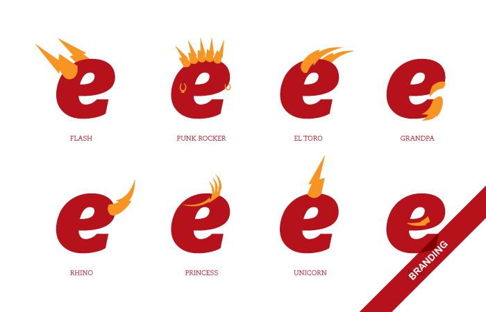
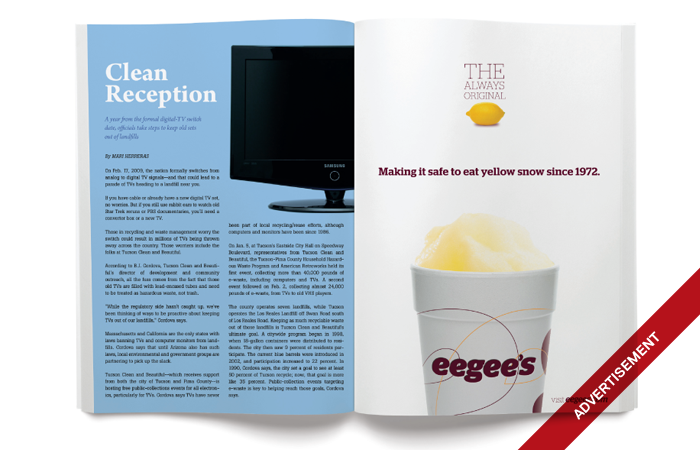
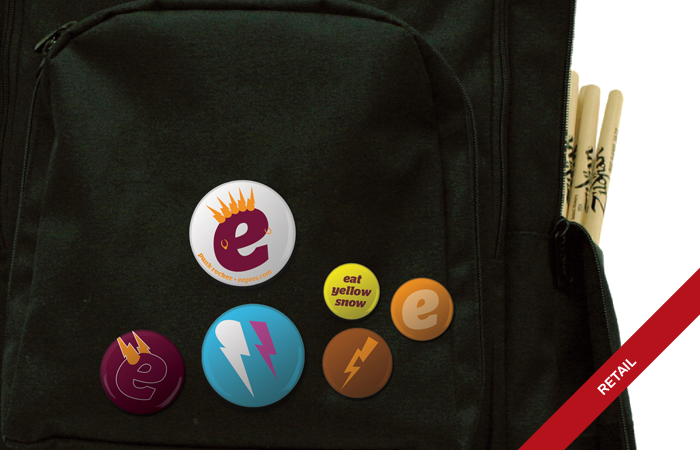
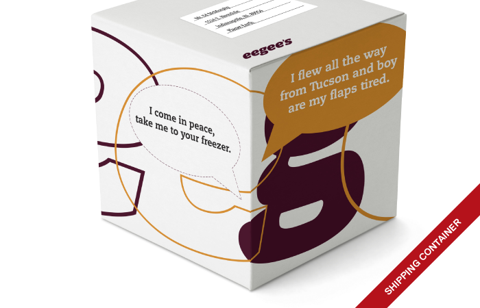
Once we came to the conclusion that a cosmetic change wasn’t going to be enough to properly position eegee’s for expansion we put together a comprehensive branding presentation that consisted of the new logo and also potential usage and brand potential. You can see some of the images from the presentation here:


Logo
We decided pretty early on that the logo should be a stand-alone word mark. It’s just more honest. We didn’t want an icon to convolute and distract the brand. Also, we felt that it would be more accepted by the fans this way. In lieu of an icon paired with the wordmark we decided that we would also use a supporting iconography to complete the ‘brand.’ The iconography could change every few years to keep the brand fun and fresh, but the word mark could stand forever.
old logo
happy little 'e'
The old logo first used a ribbon to underline the wordmark, and then they updated the ribbon with a lightning bolt. We wanted pure, timeless and honest but still fun. With a name like eegee’s it was obvious that the most important issue to tackle in picking a new typeface was finding the perfect letter e. It’s a six-letter name and four of those letters are e’s. After an exhaustive search, Stag Italic was chosen. The e looks like it’s happy and laughing which was absolutely perfect for what we were looking for.
Iconography
“What is eegee’s?” We asked this question as often as possible. What it came down to is that eegee’s is an integral part of peoples lives in Tucson. They pick up eegee’s for events. High school kids skip class and head to eegee’s. People enjoy it in the pool or at the park with their kids. On hot days eegee’s doesn’t just make living in Tucson bearable, it makes it fun. Fun is the key, the eegee's experience is fun. We then set off to graphically illustrate the fun.
illustrations, 2009
We decided on using hand drawn sketch illustrations of fun things. We created illustrations of everything from trikes and ring-pops to rocket ships and laser blasters. FUN!


