Now that we have everything sorted out as far as the logo and iconography, it was time to start putting it all into action. With a restaurant chain you’ve got a lot of different decisions to make and materials to create. We also were at the point where developing a specific ‘voice’ was important. As I mentioned before this brand is widely and deeply loved within the community. The voice had to feel familiar, more about that later.
Product Photography
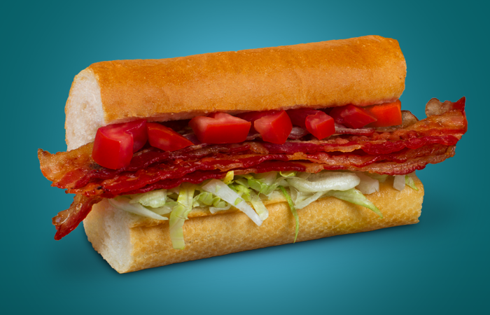
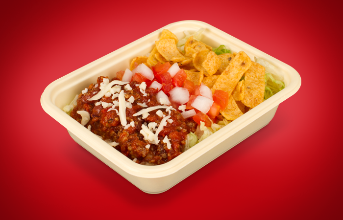
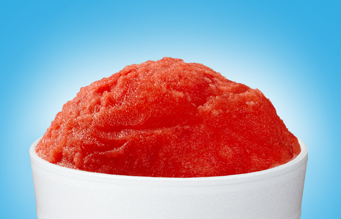
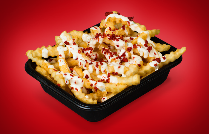
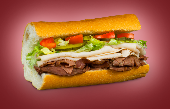
When we took stock of the product photography we were given it was old, really old. They looked like they’d been shot in the 80’s: very heavy shots with props and black backgrounds. This would prove to be one of our biggest challenges. It was something we had to fix before we could move forward with any of the rebranding. The big issue with this was that none of us had done food product photography before. Never a better time to learn, right? Tommy built a little kit with exacto blades, water spritzers, tooth picks, super-sharp knives, Q-Tips and sponges. Then we just dug in!
Voice
The voice of eegee’s was the next issue to tackle. The old eegee’s had some zany one-liners, for example on a bus bench ad for a turkey sandwich the copy line read, “Give ‘em the bird!” What we decided to do was write copy in a more familiar manner, trying to acknowledge the love of eegee’s in a fun and inclusive manner. We acknowledged the overwhelming tendency of customers to dip their fries in eegee’s ranch dressing with fun copy like, “silly salad, ranch is for fries.” Developing a solid voice that hit the right tone was very important to us, we wanted to celebrate our local roots by being a little, well, weird. This differentiated us from the big box national chains.
Packaging
Fries are one of the differentiators for eegee’s. There are lots of sandwich places, but not many that sell french fries. One of the well established traditions at eegee’s is dipping your hot fries in ranch dressing. We wanted the boxes to be ‘fun’ and have different sayings on them. These were widely loved, we saw lots of twitter photos customers took with the fry boxes in them.
The cups were used as the main place to feature the iconography illustrations. Seeing as the drink, called eegee’s, is the main focus we decided this would be the place to brand the illustrations heavily. Each cup got a different fruit-inspired color to keep the lineup interesting and also serving a secondary purpose of speeding up service by giving the employees a quick visual cue for different sizes.
Website
The
website proved to be one of the areas where we could make the biggest
improvement. It needed to be updated in a bad way. The old website
didn’t communicate much more than a menu, some kids games and location
map. The new website made much better use of the homepage space to
effectively communicate the flavor of the month, limited time offer
sandwiches, coupons and a newsletter signup form. We also incorporated
the career application into the website, eliminating the need and cost
of using a third-party site for this function.
Coming Soon - Rebranding eegee's - Part 3 - "Celebrating 40 Years of a Local Icon"


